The Right Ways to Ask Users for Permissions – Mobile UX Design

 Did you know that the average app loses 80% of its daily active users within the first 3 days post-install? Most people download an app, open it once, and delete it. This happens because users try out a lot of apps but decide which ones they want to delete within the first few days.


(toc)


0

Are these user behaviors a result of poorly made apps? Not always, but the first interaction with the app plays a key role in creating an overall impression (either good or bad). And when users open a new app the last thing they want to see is multiple popups in a row asking for permissions:

  • App Would Like to Access Your Locations
  • App Would Like Access Your Contacts
  • App Would Like to Access Your Camera

This action has a very negative impact on user experience and usually leads to the app being discarded. The app needs to be able to keep in touch with users before asking for permissions, in order to retain engagement. In this article will get you on the right track by helping you avoid common pitfalls in your permission request logic.

Build a Strategy

When it comes to requesting permission, the worst thing an app can do is to bombard users with permission requests without any notice or explanation. Both asking your users for permission too early or for too many things at ones are common mistakes. And yet, many apps still do that — right up front, as the first thing the user sees when opening the app. For example, Inbox by Gmail asks for permissions even before its onboarding tour, with no additional information or context.

1

When you send permission requests, you expect all users to accept the request. In order to achieve this goal, you should build a permissions strategy. Permission strategy depends on the clarity and importance of the permission type you are requesting. Critical permissions should be requested up-front, while secondary permissions may be requested in-context.

2

When to Ask The User

One of the biggest factors that determine whether users accept or deny your requests is when they occur.
A simple rule: Don’t ask a user for access until you really need it.

Ask Up-front Only For Critical Permissions

For many apps, not getting access to data can change the entire user experience. For example, if an app depends on SMS service, declining access to the service makes the app useless. Luckily, users expect a messaging app to request SMS permissions, so requesting it up-front makes sense.

3

When more than one permission is needed for a feature to work, ask for those permissions only and nothing extra.

Takeaway: Make sure the user clearly understands what the app does (based on the app’s description or previous familiar experience) and ask up-front only critical permissions which user expect the app to request.

Ask For Permissions In-context

In most cases, if a new user experience begins with a set of permissions requests, you may be missing a critical opportunity to engage users. Apps should ask for permissions in context and communicate the value the access will provide. Because once users are engaged, they could be more likely to accept your requests.

4

Takeaway: Users are more likely to grant permission if asked during a relevant task.

How To Ask The User

Apps should clarify why each permission request is needed, either through the feature name or an explanation provided. Remember, if you want to get a Yes answer, you have to ask nicely.
A simple rule: Make sure it’s crystal clear for users what they’ll get in return for accepting the request.

Benefit Explanation

Permissions that are less clear should provide education about what the permission involves. If your app has a walkthrough, use it to explain what your app does and why unexpected permissions will be requested.

5

Explaining a permission in context is another well-done example — it helps gauge user interest and improve comprehension of the permission. Try to explain to a user the benefits they’ll receive by giving the app access.

6

Priming During The Request

You can do this by providing a background image that explains the permission request. Foursquare primes users by providing a background image that explains why the app needs that particular permission.

7

“Primer” Message Before Actual Permission Request

You can only trigger iOS default permission request once per feature. The worst possible thing is for a user to deny permission at the system level, because reversing that decision in iOS is very complicated. In most cases, it’s better to “prime” your users to accept requests before the actual iOS permission request screen appears.

Cluster is a good example of priming before the request. Cluster’s flow includes a context-building screen, a primer, and then finally the permission request. Using pre-permissions dialogs made the “Don’t Allow” problem for Cluster almost disappear.

8

“Primer” is a pre-permission educational overlay with a dialog. Image credit: Cluster

Ask In Context of Action

User-triggered dialog works even better that context-building screen, because users are expecting the request and more likely to allow a permission when they want to use the feature it enables. Wait until a feature is invoked to request permission. When the user taps a feature like the camera in Cluster app, that triggers the request for photo permissions.

9

Prompt users to accept permissions only when they try to use the feature. Image credit: Cluster

How To Deal With Denied Permissions

Because denying permissions may prevent a feature from working as intended, whenever permission is denied it should be explained to the user.
A simple rule: You should provide feedback whenever permission is denied.

Critical Permissions

If the app can no longer run because critical permission has been denied, explain why that permission must be allowed and offer a link to open Settings so the user can allow it.
Below is an example of Google Hangouts screen that explains that permission is needed for an app to function.

10

Conclusion

Clearly every app is different, but you should thinking about when the user would need access to different parts of their phone and data, and making sure they expect to be asked. Improving the user experience is an ongoing experience. Don’t miss the opportunity to prepare your user to accept permissions! Test each case to see what works best for you.

Free All-in-One Vector Graphic Design Editor Lunacy 5.0

 Now Lunacy is perfect to streamline your workflow with a free design software full of smart features and built-in assets: it’s ver. 5.0 comes out packed with features, performance, and smarts.

lunacy design software

The Lunacy editor has been in development for the last few years as an immature product, but now it is a full-featured design tool for Windows that lets you work with (and save) Sketch files without lock-in associated with Figma or Adobe XD. As a native app, it can take advantage of your computers GPU and works great offline as well.

lunacy design software

Features and Improvements

A few of the new features in version 5.0:

  • Stability and performance have been dramatically improved

lunacy design software

  • AI-powered background removal
  • New smart features save you time on repetitive tasks like rounding corners, creating placeholder content, and making shapes

lunacy design software

  • Full UI kits integrated
  • Text and layer style library
  • Symbol and hotspot overrides to reduce symbol duplication

lunacy design software

  • Get ultra-fine 4K assets just by clicking ‘supersize it’
  • Icon, photo, or illustration assets of pro-quality can now be individually purchased. Best of all, most are just $1! This is great news for those who do not want to buy a full Icons8 Pro license, but still, need high-quality graphics from time-to-time.* Being 100% free, asset purchases enable us to continue the development of Lunacy.

lunacy design software

…and of course, we squashed a serious number of bugs, nearly ~1k!

Note: Some features are only available in the Lunacy version from the Microsoft Store. If you are using a direct-download version we suggest grabbing this new release from the MS Store.

Free Tool to Create Custom Illustrations

Free Tool to Create Custom Illustrations

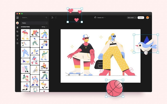
 Illustrations present a well-proven way to enhance user experience. Yet, if you are not an illustrator, it may be a challenge to get custom images that won’t cost a fortune and will tell your specific story. To solve the issue, today we’ve released Vector Creator, a free tool that allows creators to make striking illustrations right in their browser.


(toc)


 No design experience is required to use the tool: 3,000+ elements in 12 styles are ready to spice up your UI or social media.  Join the release party on Product Hunt or explore the details about it right here.

Basic Benefits

With Vector Creator, anyone can tell their story by crafting the perfect illustration without the help of a design team. The major benefits to mention are the following:

  • Fast in-browser creation
  • Huge library of 3000+ clipart elements
  • Free to use with attribution for personal and commercial projects
  • Categorized & searchable

Background

Vector illustrations have exploded in popularity recently and are becoming much more niche-focused. After the great reception for our illustration library last year, we needed a way to scale the creation process to cover any use case. So that is exactly what we built: Vector Creator, an in-browser design tool enabling anyone to create professional illustrations.

vector creator editor

Feel some vector magic: choose from categorized and searchable styles, then drag components to the canvas, arranging them however you wish. When you are done, simply export the results in PNG or SVG (premium).

vector creator illustrations

We kept the experience approachable to ensure everyone could make custom vectors quickly, even without design experience. The Vector Creator is free to use, just remember to link back to Icons8 when using your creation.

vector creator illustrations

To satisfy the common request of ‘more please’ we worked with artists to create a massive illustration library. Containing over 3000 elements in 12 distinct styles (& still expanding!) there should be more than enough variety to keep you busy. But if not, you will soon be able to upload your own media as well.

vector creator illustrations

We hope you will use the vector image creator to liven up your next landing page, onboarding flow, presentation, or social media post. Have fun with it!

Features

Let’s dive a bit deeper into what you get and what you can do with our online vector creator:

  • Compose illustrations without needing to learn or download tools
  • 12 striking styles to fit any theme
  • Build unique vectors, not overused illustrations from templates
  • People, animals, objects, shapes, and backgrounds
  • Upload your own vectors and images (soon)
  • Free to use
  • Export to transparent PNG or editable SVG

vector creator illustrations

Well, let’s cut the talk and walk the walk: welcome to try Vector Creator by yourself and let us know what you think.

How to Check Website Content Before Publishing?


Content marketing has proved to be an essential part of any kind of website optimization. Today, marketing and sales departments are working closer than ever before. It is hard to argue that today’s market is user-driven and will likely remain such in the next decades. The survey has shown, that 76% of customers expect vendors to know their needs. In order to cater to the readers’ interests, more and more marketing teams put product advertising and discounts aside, while focusing on quality website content, as well as engaging user-business interaction instead.


(toc)


In order to be on top of your competition, delivering flawless, top of the line content is a must. There are a lot of things to pay attention to when climbing up the ladder in SEO. As the saying goes, the devil is in the details, so take time to polish your content. In order to ensure that your website shines like a diamond, here are some things to check before publishing it.

content checking

Take time to pre-write

A certain set of tools can help set the tone for creating high-quality content. These tools are used to identify the most popular topics, phrases, trending hashtags. They can also be used to generate ideas. More people are going to view content that it is structured around organic keywords. One of such tools is Feedly. This service can help to:

  • find the keywords sorted by industries and trends
  • set keyword alerts tied to a certain brand or company
  • discover related topics.

website optimization

Find relevant keywords

Running out of keywords? Then Moz Keyword Explorer is going to help you out. Get all the info and statistics about the keyword of your interest with this simple tool. Moz Keyword Explorer allows to:

  • explore keywords, root domains, subdomains or exact pages
  • sort the data by country.

keyword explorer tools website content

Plan ahead with Keyword Planner

This is a free GoogleAds tool used to analyze how certain keyword combinations will perform. It uses statistics and history of certain keyword usage to show what to expect in the future, similar to the weather forecast. Both, new and experienced content promoters will find Keyword Planner useful. A Keyword Planner will let you:

find exact keywords and longtail keyword matches
see global and local competition i.e. how many times per month people search for a certain combination of words

google keyword planner

Monitor your competitors’ content and keywords

If you are curious how your competitors’ are doing, Ahrefs is one of the best tools to use. Ahrefs is a tool used to monitor any website’s activity. It shows all kinds of statistics and the number of views each piece of content generates. In a few clicks, it is possible to get a list of keywords and backlinks that lead to your competitor’s website. Ahrefs has multiple useful functions:

  • keyword explorer
  • monitoring competitor backlink profile and organic keywords
  • content gap
  • link intersect
  • batch analysis (multiple competitors compared)

ahrefs content analysis

Know your customer

Use Google Search Console! Since the market is consumer driven, it is essential to know your consumer. Google Search Console is one of the best tools to see what people search for. This information is vital to optimize your website for natural queries. Google Search console will show you:

  • most popular search queries = what keywords people enter when your page is shown
  • how many times your web pages are shown
  • how many clicks each page gets
  • whether your page is mobile-friendly
  • how to crawl = submit your page for indexing

google search console website optimization

Edit your content with Hemingway App

This tool helped countless writers and content creators around the globe. Hemingway App is arguably the best tool you can use for content editing. The app points out any style mistakes and assesses how readable the text is. It is also very convenient because there is no need to download anything. The benefits of the app allow users to:

  • improve text readability
  • shorten long sentences
  • rephrase vague sentences

content editing app
Take some time to proofread

Grammarly is the most popular and well-known plugin to help your text look sharp. Sometimes, minor punctuation and spelling mistakes can escape a human eye, especially in a rush. You will no longer have to worry about such errors when Grammarly has got your back! Here are some of the main functions of Grammarly:

  • highlighting grammar mistakes
  • in-built synonym dictionary: if a certain phrase is repeatedly found in the text, Grammarly will offer synonyms to use instead of it
  • UK spelling
  • plagiarism check

grammar checker content optimization

Prepare high-quality content

At times it is better to let professionals generate content for your website. There are plenty of online platforms, whose writers are familiar with SEO-writing practices. A creative content writer can create top-level content for your marketing campaign. Such services usually have a creative writing/web content writing option which allows you to:

  • get SEO-optimized texts of proper length
  • have plagiarism-free content
  • save your time & money in a long-term perspective

content writing for website

Check for plagiarism

Run a plagiarism check, just in case. Copyscape is a great plagiarism checking tool that goes above and beyond. Not only does it check the content on your site for originality, Copyscape also offers some anti-plagiarism protection after you put the page on the web. Other similar tools include:

  • ProWritingAd
  • Viper
  • WhiteSmoke Plagiarism Checker
  • Duplichecker
  • Grammarly Plagiarism Checker

copy content plagiarism checker

Boost your website’s design

Try Canva, a convenient drag ‘n’ drop tool used by people with no design background and professionals alike. Make your site stand out! With Canva you get access to millions of photographs and fonts to tweak the appearance of your page. Canva will let you:

  • manage your design team and share the mockups
  • create any kind of design content: from small cards & calendars to A4 presentations and infographics
  • set custom size dimensions
  • download in png/jpg formats

content optimization web design

Edit the snippet

Yoast plugin is SEO multitool that will help you optimize your content in case you are using WordPress powered platform. Use this tool to:

  • enter your keyword tags that will be indexed by Google
  • edit your snippet: enter meta title and meta description
  • improve readability and length of your metadata

seo optimization plugin

Creating high-quality content to attract both search engines and visitors is time- and energy-consuming. Take your time to pick proper keywords with the best volume-competition ratio. Having written your text, run a plagiarism check and edit your content thoroughly. After that, remember about SEO optimization: include keyword tags, meta title, and meta description.

The above-mentioned tools are not the only viable option for the website owners. These eleven tools represent universally important stages of content creation and can be replaced. Be careful with your content since it is the virtual face of your product or service. The first impression can make or break the deal when it comes to attracting new viewers to your site.

How hosting server speed affects SEO ranking of a website?

How hosting server speed affects SEO ranking of a website?


Your site speed is linked with user experience and Search Engine Optimization (SEO). People’s attention spans have shrunken to just 8 seconds on average. A slower website means you risk losing your audience and increasing your bounce rate. Also, you can leave with unfavorable search engine impressions.


(toc)


Meanwhile, 93% of Internet experiences begin with a search engine. The top Google result has a 33% chance of being clicked. At the same time, 75% of people will not even look past the first page of search results. Plus, website speed has been one of Google’s ranking factors since 2010.

In other words, a faster website results in a better user experience, more traffic, and conversions. All of which contribute to better SEO and ranking.

For WordPress websites and similar, having a fast website begins with having a hosting provider. Continue reading to learn about how to optimize website speed for a high SEO ranking.

Why is page speed important for SEO?

Google considers over 200 ranking factors, but having meaningful and authentic content should remain your top priority. However, we saw a shift in recent years toward a stronger focus on user experience and accessibility.

Since 2010, Google has used your site’s speed as a ranking factor. Then, in 2018, they made your site’s speed on mobile devices a much more important signal. Since 2020, the big news that all website creators have been watching is the addition of Core Web Vitals as an official ranking factor as part of the Google Page Experience. The Core Web Vitals are three new metrics that measure the user experience, with website speed being one of them.

How hosting server speed affects SEO ranking of a website: collage site speed on light blue background

Create a similar site speed collage in Mega Creator.

Understanding page speed?

The name says it all: page speed is the amount of time it takes for a page to load in a user’s browser. However, optimizing your page speed is not as simple as the name implies. The site’s server, image compressions, file optimizations, and other factors all contribute to the time it takes for your page to load.

Page speed metrics

Let’s get familiar with some of the most important metrics for your website’s speed. To fully understand different page speed reports and optimize your website speed, you must first understand its terminology.

There is no single metric that determines your overall page speed rating. We’ll look at the most common ones:

  • Time to First Byte (TTFT) – The time it takes for the browser to get the first byte of content from the server, i.e., how long does it take for a page to begin loading?
  • Page Load Time – It’s simple: how long does it take for all of your page’s resources to load.
  • First Paint (FP) – The first pixel to appear in the user’s browser. This can be a background color or a header image. Improving your FP won’t help you much because the user is still expecting something meaningful to be displayed.
  • First Contentful Paint (FCP) – The amount of time it takes the browser to render the first pieces of content, such as text or an image.
  • Largest Contentful Paint (LCP) – Compared to First Contentful Paint (FCP), which measures when the first content loads, LCP focuses on the most meaningful content relevant to the user. LCP is one of the parts of the new metrics of Core Web Vitals. It measures how long it takes for your site’s main content to load. The LCP element is typically your site’s hero section, featured image, or a large text paragraph.
  • First Input Delay (FID) – FID is a real-user web performance metric that measures a web page’s interactivity and responsiveness. It takes into account the user’s first perceptions and assesses the “delay” in event processing. In other words, it counts the time between when a user first interacts with your site (for example, by clicking a button or a link) and when the browser reacts and begins processing that interaction.
  • Time to Interactive (TTI) – TTI measures the time it takes for a page to become fully interactive. In contrast, FID measures user interactions that happen before the page is fully interactive.

Measure page speed

What’s the recommended website’s load time? It is advised that a target time of two seconds or less is a reasonable goal. There is a multitude of free site speed testing options to choose from. However, there are a few things to think about before running any website speed tests or diagnostics.

Keep your variables constant

For example, when performing website performance tests, make sure you test it from the same area each time. This ensures that the physical location does not cause any fluctuations in site speed. Because servers are located worldwide, what takes five seconds to load in one place may take two seconds to load in another. That is why it is critical to test where most of your website traffic originates or an area you wish to target.

Repeat the test several times

Because tests may obtain different results each time, it is critical to repeat tests until consistency is achieved. Only then can you be sure that there is a problem that requires further investigation. Furthermore, you must ensure that both your cached and initial versions load quickly.

Now, here are some useful tools that can run speed tests:

PageSpeed Insights

Google PageSpeed Insights, which measures a page’s performance for mobile and desktop devices, is a speed testing tool that can help you improve the speed of your website.

The PageSpeed Score ranges from 0 and 100. A score of 85 or higher indicates that the page is performing well. The report page provides a helpful breakdown of the actions you can take to improve performance. PageSpeed Insights also offers suggestions for improving the user experience on mobile devices.

PageSpeed is working with field data. Field data is anonymous performance information derived from a site visitor’s experience on a web page that Google collects via Chrome mobile browsers and is then used to calculate page speed metrics.

How hosting server speed affects SEO ranking of a website: PageSpeedInsights site page

Lighthouse

Lighthouse is an open-source, automated web page quality-improvement solution. Performance, accessibility, progressive web apps, and other factors are all audited.

Lighthouse offers multiple recommendations for improving page load performance for quite some time, such as enabling text compression and removing render-blocking scripts. The team is constantly releasing new audits to provide you with even more useful tips for making your site faster.

How hosting server speed affects SEO ranking of a website: Lighthouse site page

Chrome DevTools Performance Panel

The Chrome DevTools network panel is included with Chrome. This is a popular tool among developers due to its ease of use and suitability for local debugging and testing. To open the network panel in Chrome, press Command+Option+I (Mac) or Control+Shift+I (Windows) (Windows, Linux). Following that, you can analyze your site to investigate the performance of each of your assets.

How hosting server speed affects SEO ranking of a website: Chrome_DevTools site page

WebPageTest

This is a free, open-source tool that measures the speed performance of your website. It alters your location, browser, connection type, and speed, as well as performing various tests.

How hosting server speed affects SEO ranking of a website: WebPageTest site page

How to optimize your page speed?

Starting with your hosting provider, here is a list of the best practices for improving website performance:

Choose a fast and reliable web hosting provider

A slow server response time is one of the most common causes of a slow website. Keep in mind that a fast server hosting provider can have a significant impact on your website speed. Simply put, the faster the server response time, the better the performance of your website.

SiteGround provides ultrafast hosting services powered by Google Cloud, UltraFast PHP setups, a custom MySQL database setup, and a strong defense system to prevent any type of potential threats. Their team is constantly developing new tools and service enhancements to make your website faster, safer, and easier to manage.

Enable full-page caching

When you enable full-page caching, your website’s pages are stored on the server as HTML files after the first time they are loaded. Only the first visit to your site will see the entire page content from the database. The others will get the page output directly from the server’s memory, making it significantly faster and eventually improving your SEO score.

How hosting server speed affects SEO ranking of a website: Enable full-page caching

Enable  compression

Reduce the size of your CSS, HTML, and JavaScript files by using file compression applications like Gzip and Brotli. As a result, the browser will load such files faster, allowing you to improve your site speed and, ultimately, SEO score.

How hosting server speed affects SEO ranking of a website: Enable  compression

Optimize media

Here are some good practices on how to go about it:

  • Always compress your images: you can enhance your loading time by reducing the image size without sacrificing quality.
  • Serve images in next-gen formats: such as JPEG 2000, JPEG XR, and WebP. In light of this, Google recommends the WebP format.
  • Lazy load static content: lazy loading is the practice of deferring the loading or initialization of resources or objects until they are needed to improve performance and conserve system resources

Optimize Front-end

With the use of various front-end optimizations such as minifying CSS and JS files, optimizing fonts, and more, you can reduce the actual size of your website pages and improve loading time.

Use a CDN

Aside from the server that hosts your site, you can use a content delivery network (CDN) to reduce the time it takes for all of your visitors to load. The CDN will cache your content across a global network of servers and load your website from the closest one to the visitor, improving their experience with your page.

How hosting server speed affects SEO ranking of a website: CDN and without CDN

How else can you optimize site speed with SiteGround?

SiteGround users enjoy out-of-the-box full-page caching solutions, called Dynamic caching. It is enabled for all sites by default. Depending on the type of site, you can get up to five times faster page loading.

SiteGround has deployed and enabled by default the next-generation compression algorithm – Brotli. This algorithm increase loading speed to 15-20%.

Optimizer plugin helps you with image optimization, lazyloads media, and more.

After speed tests, you can refer to SiteGround’s essential speed tips list for effective website optimization. Also, you can learn how to create a high-performance website and get expert tips in the WordPress Speed Optimization ebook.

Site speed is critical because it aids SEO, enhances the user experience, and increases conversions. Remember to test your site speed numerous times from the same location for reliable and comparable results.

How to Design Best E-commerce homepage?


How to Design Best E-commerce homepage?

Your homepage is often the first time customers have an opportunity to judge your brand. It will likely be the first place customers land after clicking an ad or searching for a specific product. Therefore, you must make a lasting and positive impression.


(toc)


A good homepage can establish trust and help to drive sales from your online store. But how exactly does a homepage design affect user experience? And what can you do to optimize your homepage design for the best results?

Homepage design and how it affects user experience

Those familiar with online marketing in the field of eCommerce will know the effect a landing page can have. However, homepages are just as important, if not more so. This is because most of your traffic will not hit specific landing pages but will land on your homepage.

This is even more vital if you are an established brand or good at generating brand awareness. Loyal customers who already know about your company are likely to go straight to your home page. Therefore, the experience they have on your homepage will shape the success of your store.

Should a user find your homepage practical and easy to use, they will have a positive experience. This will lead to continued loyalty, as well as increasing the likelihood of them spending more time and money on your website. Slow loading speeds, complex interfaces, or other issues can force shoppers to head to a competitor’s store.

In short, your homepage design affects the practicality and enjoyment a user has when shopping with you. A good homepage can instantly create a positive impression and experience. It is the ideal start to building a relationship with any customer.

How to perfect your eCommerce homepage design – best practices

Make sure the load speed of the homepage is good

The first essential element of any homepage is its load speed. If your homepage doesn’t load quickly, customers will start to lose patience and be deterred from using the website. This will cause you to lose out on important conversions.

A few things can slow your website down, including a poor server and too much clutter. For example, excess images or flashy graphics. Therefore, you should try to keep your homepage simple in design. Also, ensure you have a server that can meet your demands. You can always A/B test your homepage’s load speed to find the guilty variable if you are unsure what is slowing it down.

A homepage that is optimized and loads quickly will ensure your site is actually judged on its quality. This allows you to enhance other elements of your homepage.

Highlight your site security

When buying online, customers want to feel secure. If you do not show your website’s security, customers worried about their safety will shop elsewhere.

To avoid this, make sure you have an SSL certificate visible on your homepage (and ideally throughout your website). You can do this by adding a trust seal to your homepage, which clarifies the safety of your store to any potential buyers. SSL certificate reassures your customers even more.

Have a clear and easy to use the navigation

Clear and easy-to-use navigation will make a significant difference to your online sales. This is because it will help customers to find what they are looking for with a few clicks. Without an effective navigation bar, customers will often leave their efforts to buy from your store.

The best navigations have descriptive categories and subcategories. It allows customers to find products in their area of interest quickly. They also usually include a search bar option for customers who know exactly what they want. Navigation bars also encourage customers to browse due to the experience being more convenient easily. This can help add to the average order value of your store.

Optimize for mobile and tablet

Mobile and tablet sales are constantly growing in the eCommerce sector. Therefore, you must cater to users buying on those devices. By optimizing for mobile and tablet, you create a seamless user experience that makes buying on such machines as easy as on the desktop.

Just like on a desktop, you will need to include both navigation and search bars. However, they cannot be as large as on desktop, so they will need to be in the form of a drop-down menu. You will also need an uncluttered page with a large and clear CTA. All of this helps to make the mobile experience more responsive.

Ensure the page isn’t cluttered

A clear, uncluttered homepage has numerous advantages. Firstly, it helps your site to load at a better speed. It also makes it easier for customers to navigate their way around your website. Finally, it makes the remaining content on the page much more impactful, as CTA’s and images are not fighting for the user’s attention.

In contrast, a cluttered homepage can drastically increase the bounce rate on your homepage. This is because it will load much slower, and it will be overwhelming to many consumers. It can also make it incredibly difficult for customers to find their way around your store and make a purchase, thus decreasing your sales.

When creating your homepage, it is best to stick to a minimalistic design. Try to eliminate white space, and have a clear direction to send your potential customers. This will help to avoid any confusion about where to find products and help you maximize your sales.

Feature your best selling products

As an eCommerce site, selling products online is your main focus. So why not put some of the best sellers on the homepage, and take advantage of all the views it gets. You can even adapt these products to items that customers have shown interest in through browsing or past purchases.

Using A/B testing, you can even check whether personalized featured products or best sellers worked better for you by using A/B testing. Just ensure that any products you do feature are well displayed and do not clutter the page unnecessarily.

Use high-resolution images

If you feature images on your homepage, you should ensure that they are of the best quality. This means using high-resolution images that highlight the product clearly. You should focus on easily visible images on any device, so mobile users don’t have to zoom in to see features.

Both product and lifestyle images can be just as effective, depending on what you are selling. So you should consider trialing both image types. Check which is the most successful in terms of creating conversions for your business.

Make your branding visible without being overbearing

In many cases, a brand brings association, trust, and reliability. Therefore, it is worth displaying your branding on your homepage, even if you’re fairly new to the eCommerce industry. Established brands will use their brand to create a sense of safety and generate loyalty to their site. For new brands, this factor will not appear immediately. However, branding on the homepage allows them to build that same presence over time.

It is important to note that you should ensure it isn’t overbearing when including your branding on your homepage. Keep things simple, and use branding as a reminder rather than a sales technique.

Use social proofing

f you’re looking to generate trust with potential customers, there’s no better place to start than on your website’s homepage. Building trust with potential customers can be done in some ways, but one of the most effective is using social proofing.

In essence, social proofing is using customer-generated information about your company. It highlights to new potential customers that your brand is honest and of high quality. This information commonly comes in the form of things like customer reviews or social media posts. By using social proofing, you offer potential customers an unfiltered view of your brand and its products. This, in turn, generates trust and makes new customers more comfortable buying from you when they can see those reviews or posts on your homepage.

Make contacting you easy

Being easy to reach also helps to generate trust with consumers. This is because customers feel like they can resolve any issues that may arise with a potential order. It also adds an air of authenticity to the store.

Ideally, you should try to take a customer-focused approach to be contacted. Therefore, it is best to offer customers several ways of getting in touch with you. That way, customers can opt for their preferred method of contact, which they are most comfortable with or most convenient for them. Email, social media, etc. – most of which you can add to the top or bottom of your homepage in the form of icons.

A/B test variations

There is no perfect homepage design that fits every company. Therefore, it is important to test which designs work best for you. By using A/B testing, you can compare two different variations of your homepage against each other. By making small, incremental changes, you can design the ideal homepage to maximize conversions and sales.

However, it is important to note that one design isn’t perfect forever. Customers need and won’t change, as does any sector of business. For that reason, it is important to A/B test regularly to stay on top of any potential changes in your market.

Final thoughts

Your homepage is a vital element in the success of your online store. It is at the forefront of your business and its branding and the first point of contact for many customers. This means taking the time to optimize it is essential. By following these tips and patiently tweaking your page over time, you can be sure your homepage will have a lasting impact on customers.

How to Create Seamless Christmas Pattern? Step by Step Tutorial

 With Christmas and New Year around the corner, you may need a seamless background pattern to use on your website, social media, app, game, presentation, custom card, banner, original T-shirt, or any other creative project you may imagine. Here’s the post that will show you how to do it. In addition to our Christmas vectors freebie and collection of Christmas clipart and icons, we’ve made a simple step-by-step tutorial on creating a seamless Christmas pattern in Adobe Illustrator.


(toc)


Here you’ll find 10 easy steps. You can use our free Christmas icons or any other SVGs. 

1. Create a Square

It can be of any size, depending on your needs. This one is 300x300px.

how to create christmas pattern
2. Place a Few Icons Crossing Two Sides of the Square

Choose the Select tool. It’s in the top left corner. Select the icons crossing the vertical side of the square to continue editing the pattern.

how to create christmas pattern
3. Find the Move Function

Click with the right mouse button on the selected icons and go to Transform > Move… in the context menu. Alternatively, use the hotkey combination Shift+Ctrl+M.

how to create christmas pattern
4. Copy Icons to the Other Side of the Square

Set the Horizontal to be the same as the size of the square (here it is 300 px). The Vertical must be 0. Click the Copy button.

how to create christmas pattern
5. Do the Same Thing to the Horizontal Icons

Select the icons crossing the horizontal side of the square and repeat the Steps 2-4. The only difference is that you set Horizontal as 0, and Vertical as the size of the square (300px here).

how to create christmas pattern
6. Fill the Rest of the Square with Vector Icons

Place them in any order you like. It will be the base of your pattern.

how to create christmas pattern
7. Delete the Square

Select the square with the Select tool or press V on your keyboard. Then click the Delete button.

how to create christmas pattern

8. Open the Pattern Menu

Select all the icons and go to Object > Pattern > Make. The menu box for your pattern will appear.

how to create christmas pattern
9. Set Up the Pattern

In the appeared window set Width and Height parameters as you used for the deleted square (ours was 300x300px). Click Done at the top of the document window.

how to create christmas pattern
10. Find Your Pattern at the Swatches Panel

Voilà! Your awesome seamless pattern waits for you at the Swatches panel. Now you can create any shape and color it with your Christmas pattern.

how to create christmas pattern

We wish you a Merry Christmas and Happy New Year!

How to create a set of abstract digital screens for your next animated project?

 Let’s see how to create a layout and combine illustrations that perfectly visualize complex concepts or topics and don’t confuse the audience.

In this piece, we’ll explore how to create a nice set of digital windows for your animated compositions using Adobe Illustrator. See how they can build upon each other and help make your videos (learn more about making effective animated videos with this guide) not only understandable but also visually captivating in just a few steps.

(toc)

Pick the colors and elements

It’s important to set a cohesive style from the beginning. For that, you’ll need to determine your color palette and decide whether you’ll be using outlined or solid elements (or both!).

Start with a number of miscellaneous elements that are in tune with your brand identity (see a short guide on how to create your own brand identity here) and the graphic style you’ll be using in your project. You can create a set of multiple shapes or vectors that can share the same visual language, such as “round corners,” “thin lines,” etc.

Create the layout

Use these elements to form layout variations for your screens. You can scale them up and down, switch colors, play with the outline thickness, and arrange them in many different compositions.

This is a quick example of how you can use the same set of geometric shapes in 2 different contexts:

By playing with different layout variations based on the same shapes, you can expand your compositions to a wider list of options and even pack complex concepts into clear geometric patterns. For example, you can use multiple rectangles to represent the idea of a project’s timeline:

Compose the setting

Once you get the hang of variation and conceptualization, you’ll be ready to create a set of up to 8 different content layouts for your screens. Playing with shapes and compositions is an incredibly stimulating exercise. By doing it, you can generate a variety of visuals like graphic bars, charts, diagrams, and more. The possibilities are almost endless!

You can also experiment with background colors, add details such as tiny circles at the top that simulate interface icons, and even play with transparencies (if that’s part of your project’s visual style, of course). Once you’re happy with the set of screens you’ve created, you can arrange them in a symmetrical group.

Add the volume and perspective

Make a copy of the group in a different layer and go to Effect > Warp > Bulge. This will open the effect window settings. There, you can set up your composition and establish the depth you wish to achieve.

(We always recommend keeping the original flat group on a different layer, so you can import those assets to your animation software and add the depth effect directly into the animation).

And done! Now you have an eye-catching composition of multiple screen windows, simulating a 3D environment that would be very useful for an animated scene with characters interacting with them.

How to design a mobile app in Lunacy?

 Add a mobile app project to your portfolio and get familiar with all the basic features of Lunacy. A step-by-step tutorial for beginners. Repeat and learn.

Throughout this tutorial, we’ll create five basic views of an e-learning app with all the essential UI elements used in all types of mobile apps. You’ll learn how to work with components, color variables, styles, and other time-saving things in Lunacy. And here is what your design will look like when you get to the end.

Mobile app final design

We’ll start with creating an onboarding view and a sign up form. You’ll work with shapes, create styles and color variables.

Create a new document.
Create an artboard. Enable the Artboard tool (A) and simply click over the canvas to use the default iPhone 13 preset. Or select any other preset from the list.

Designing a mobile app in Lunacy Step 1

Create a rectangle with the following settings: size 390*360px, fill #BABFFF, and corner radius 20px for lower corners.
Create a color variable through the Color Picker. Lunacy will automatically generate the variable’s name, but you can change anytime.

Designing a mobile app in Lunacy Step 2

Add the status bar from the UI kits. Go to Apple iOS UI kit > Bars > Status bar > iPhone > Light and drag the bar component onto the canvas.

Designing a mobile app in Lunacy Step 3

Switch to the Illustrations tab and place an illustration over the blue rectangle. I used illustrations from the Casual life 3D pack.

Designing a mobile app in Lunacy Step 4

Enable the Text tool (T) and add a text block below the rectangle. I used the following text settings: Inter Bold, size 28, color #17232D. Create the second color variable (Shark).

Designing a mobile app in Lunacy Step 5

Create the first text style to re-use these text settings later and give it a name. For example, H1 28 Bold, where

  • H1 is the level 1 heading in our design
  • 28 is the font size
  • Bold is the font weight.

Designing a mobile app in Lunacy Step 6

Add another text block below: Inter Regular, size 14, color variable Shark.
And create the second text style with the name Paragraph 14 Regular.

Step 7

Now, let’s create a current page indicator.
For this, we’ll use two ellipses and a rounded rectangle. Create the first ellipse with the following settings: size 8*8 px, color #CFD3D6. Save the color as a color variable (Iron).

Step 8

Create a rounded rectangle with the following settings: size 23*8 px, corner radius 5, color #53DF7D, color variable Pastel Green.
Duplicate the first ellipse.

Step 9

Now, we’ll create a button. Add a rectangle with the following settings: size 344*50 px, corner radius 12, color variable Pastel Green.

Step 10

With the rectangle selected, enable the Text tool (T). The text block automatically groups with the rectangle and aligns with the center of the shape. The text settings are as follows: Inter Medium, size 18, color #FFFFFF. Create one more color variable (White).

Step 11

The first view is ready.
Let’s create another one. Add a new artboard.

Mobile app design Step 12

Add a rectangle: size 390*360px, fill #ABFFEB, and corner radius 20px for lower corners. Or simply copy the rectangle from the first artboard and recolor it. Create a new color variable (Ice Cold).

Mobile app design Step 13

Don’t forget to add the status bar.

Step 14

Add another illustration from the Illustrations tab and place it over the rectangle. I used an illustration from the same Casual life 3D pack.

Step 15

Create a text block under the rectangle. Apply the H1 28 Bold text style to it.

Step 16

Create a rectangle with the following settings: size 344*50 px, corner radius 8. Add a border with color variable Iron, and delete the main fill.

Step 17

Add a text block with the Paragraph 14 Regular text style and generate an email address using the Generate Text tool in text settings. An input field is ready.

Step 18

Duplicate the field. Edit the text and set its color to color variable Iron.

Step 19

Duplicate the Next button from the first artboard. Rename it to Log in.

Step 20

Create a 36*36 px circle. Delete the fill and add a border with color variable Iron.

Step 21

Open the Icons tab and find the Google icon. Fit it into the circle.

Step 22

Create two duplicates and change the Google icon for other logos (Apple and Facebook) using the Icon tool.

Step 23

Add the last text block and adjust the text settings. The settings of the first part: Inter Regular, size 14, color #727272, color variable Tapa.

Step 24

The settings of the second part: Inter Bold, size 14, color variable Emerald.

Step 25

Make sure that all the layers are perfectly aligned.

The second view is ready.

First and second views

Internet and Intranet

Internet and Intranet

In this chapter, we will see what is Internet and Intranet, as well as discuss the similarities and differences between the two.

Internet

It is a worldwide/global system of interconnected computer networks. It uses the standard Internet Protocol (TCP/IP). Every computer in Internet is identified by a unique IP address. IP Address is a unique set of numbers (such as 110.22.33.114) which identifies a computer’s location.

A special computer DNS (Domain Name Server) is used to provide a name to the IP Address so that the user can locate a computer by a name. For example, a DNS server will resolve a name https://www.google.com to a particular IP address to uniquely identify the computer on which this website is hosted.

Internet is accessible to every user all over the world.

Intranet

Intranet is the system in which multiple PCs are connected to each other. PCs in intranet are not available to the world outside the intranet. Usually each organization has its own Intranet network and members/employees of that organization can access the computers in their intranet.

Each computer in Intranet is also identified by an IP Address which is unique among the computers in that Intranet.

Similarities between Internet and Intranet

  • Intranet uses the internet protocols such as TCP/IP and FTP.

  • Intranet sites are accessible via the web browser in a similar way as websites in the internet. However, only members of Intranet network can access intranet hosted sites.

  • In Intranet, own instant messengers can be used as similar to yahoo messenger/gtalk over the internet.

Differences between Internet and Intranet

  • Internet is general to PCs all over the world whereas Intranet is specific to few PCs.

  • Internet provides a wider and better access to websites to a large population, whereas Intranet is restricted.

  • Internet is not as safe as Intranet. Intranet can be safely privatized as per the need.